Uproad app
Project overview
Uproad app is a simple mobile tolling solution. With Uproad drivers can use toll roads, skip cash lanes and conveniently pay toll charges on the go. On top of that, users can receive real-time Toll Alerts with estimated toll costs every time they pass a toll point.
Challenge
Tolling apps tend to struggle with design and usability, as most of them are managed by government agencies. Our team aimed to change that, so we focused on making Uproad as straightforward as possible.
When I joined the team, we faced three UX challenges that had to be addressed:
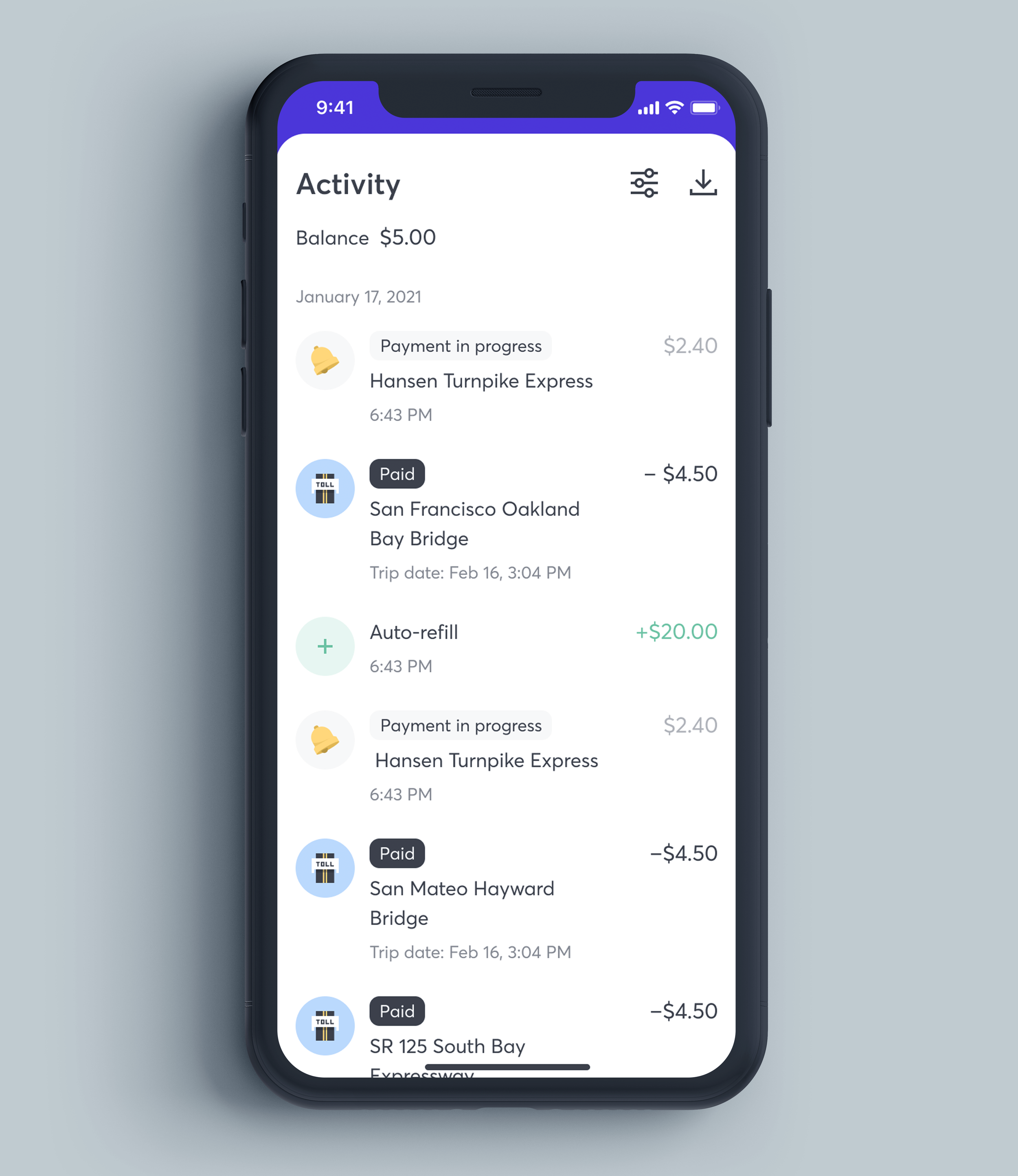
1. Payment delays
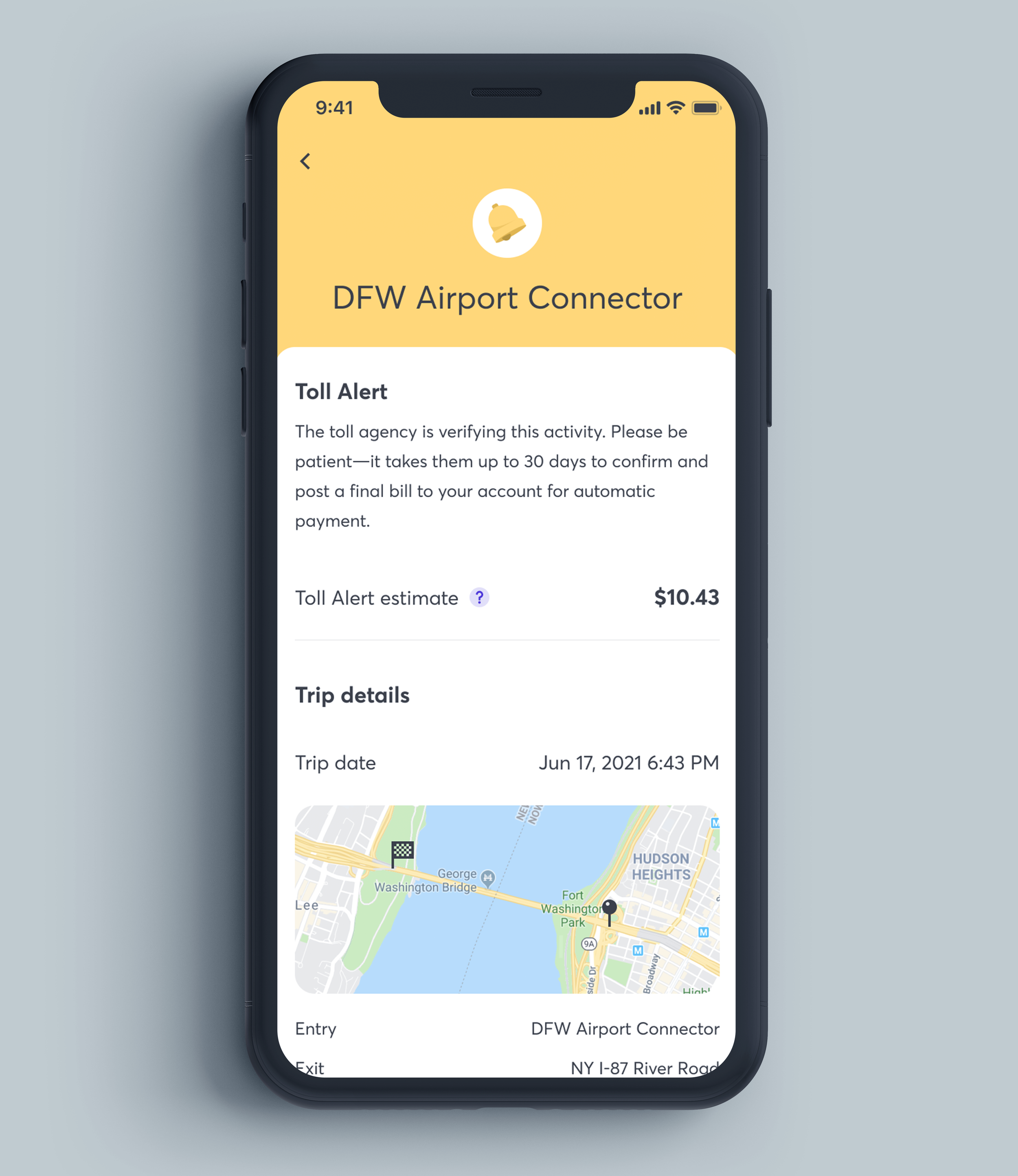
Tolling agencies cannot charge users right away, so there’s always a delay with the payment. It usually takes from 1 to 30 days to process the toll payment.
At that moment, Uproad did not communicate that anywhere in the app, so the customer service department received hundreds of requests regarding payment delays weekly.
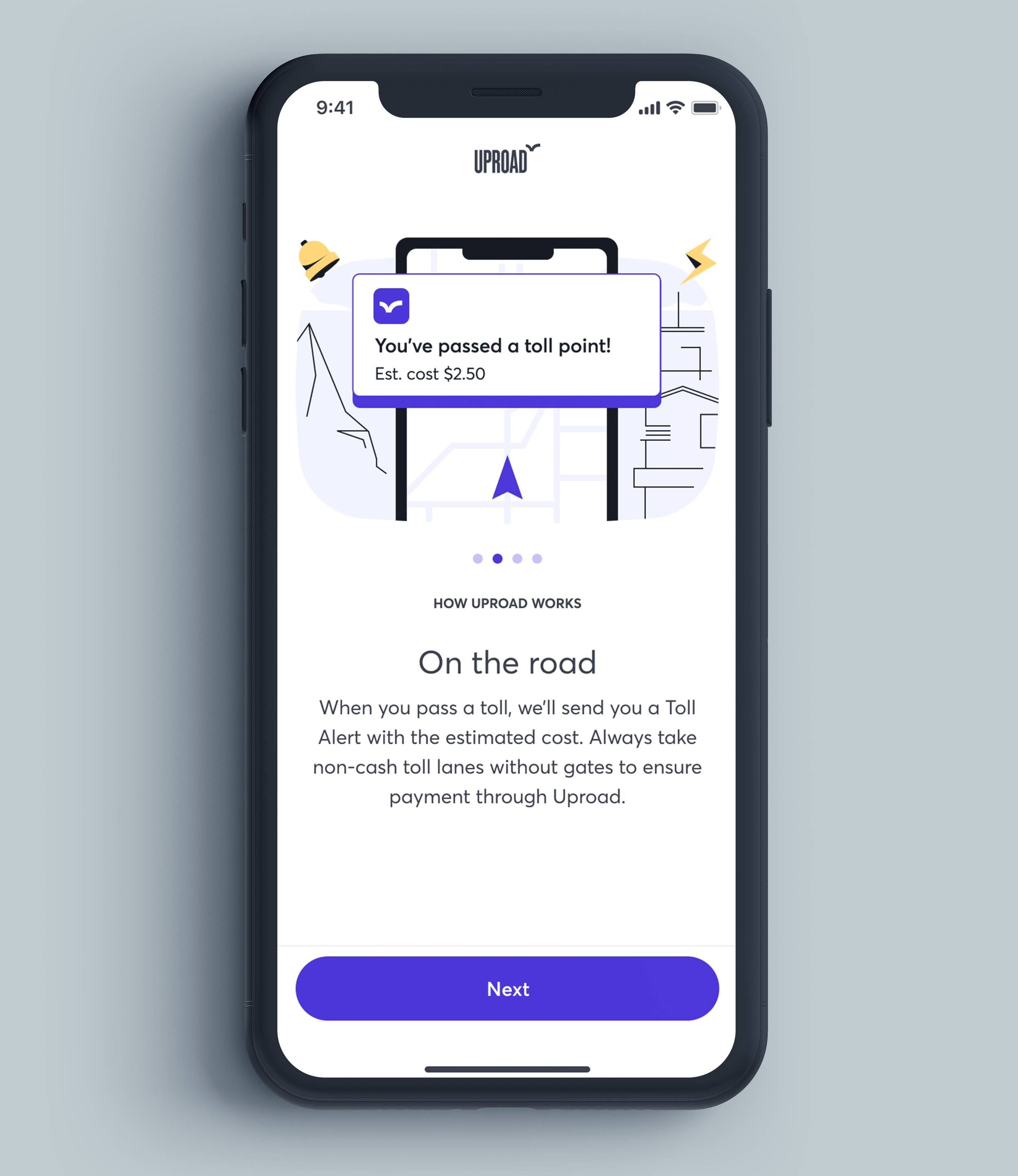
2. How it works
Mobile tolling is still a relatively new thing. So on the other hand, we had users who did not know how tolling apps work.
While transponders/stickers (physical box on the windshield) remain the most popular way to pay digitally, many users did not know what lanes they should take to avoid double charges.
3. Different states, different rules
Many drivers download Uproad after they’ve already passed a toll point, but only one tolling agency allows that. So we need to somehow communicate that only drivers from California can pay previously unpaid tolls.
Process
Being a goody-goody is kinda lame, so let’s start with the copy that failed!
Our initial idea was to put a label ‘Payment in progress’ on every Toll Alert in the account activity. Unfortunately, A/B testing results confirmed the depth of this problem — people needed more information than just a tiny label. It should be a comprehensive explanation of what’s happening and why. This way, we just made people think that we’re processing their payments too slow on our end.

To resolve this, we made two major changes in the user experience:
1. Introduced new onboarding experience with the educational walkthrough
2. Redesigned transaction details screens
This way, new users are informed on how the app works during their account setup. Informational blocks in transaction details serve as an additional reminder for everyone who’s scared of delayed payments.
Result

New onboarding walkthrough sets proper expectations for a user. We also had to make a different screen for California users as only they can pay their past tolls.